What is a Whale Curve?
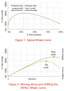
Whale Curves are graphical representations of the concentration of firms’ profits, usually plotting cumulative profits against cumulative products ranked by profitability. As shown in the typical Whale Curve, 20-30% of products usually generate 300% of profits with the remaining 70-80% of products destroying 200% of profits.
WP&C’s preferred Whale Curve plots cumulative margin adjusted for complexity costs against cumulative revenue (Figure 2). This illustrates the impact of complexity costs on firm profitability. As complexity is added with more products and revenue, costs grow geometrically to a point after which additional complexity costs exceed the value being created. Maximum profitability occurs at this inflection point.
Why is a Whale Curve important?
The stark representation of profit concentration provided by a Whale Curve can be eye-opening; understanding how few products create profit and how many destroy it can be a firm’s call-to-action to identify and remove complexity costs. While the profit-destroying elements certainly warrant attention, identifying the level of profit concentration also serves to underscore the need to appropriately resource and support the key 20-30% of profitable products. Often, these profitable products are under-supported, as they are treated the same as the rest of the portfolio.
The position on and shape of a firm’s Whale Curve is dynamic, and WP&C has a deep understanding of how to move along and reshape Whale Curves to move to positions of higher profitability. Moving along the Whale Curve by eliminating unprofitable SKUs is the conventional course of action. While this is a critical first step, WP&C recognizes that stopping there leaves considerable opportunity and suggests focusing on reshaping the Whale Curve. Our expertise in identifying and reducing complexity costs can shift the curve up and to the right (Figure 2), allowing for even higher profits with minimal impact on revenue.
Example of how a Whale Curve is used?
An agricultural product manufacturer was struggling with a huge number of SKUs spread across its many manufacturing facilities. By developing and analyzing their Whale Curve, one facility found only 21% of its products to be profitable and generated 380% of profits. The remaining 79% of products, representing only 19% of volume, destroyed 280% of profits. Selectively removing unprofitable SKUs (moving them up and to the left on the Whale Curve) and modifying their plant loading to eliminate significant transportation and storage costs (shifting the Whale Curve up and to the right) led to a quick 25% profit improvement.

